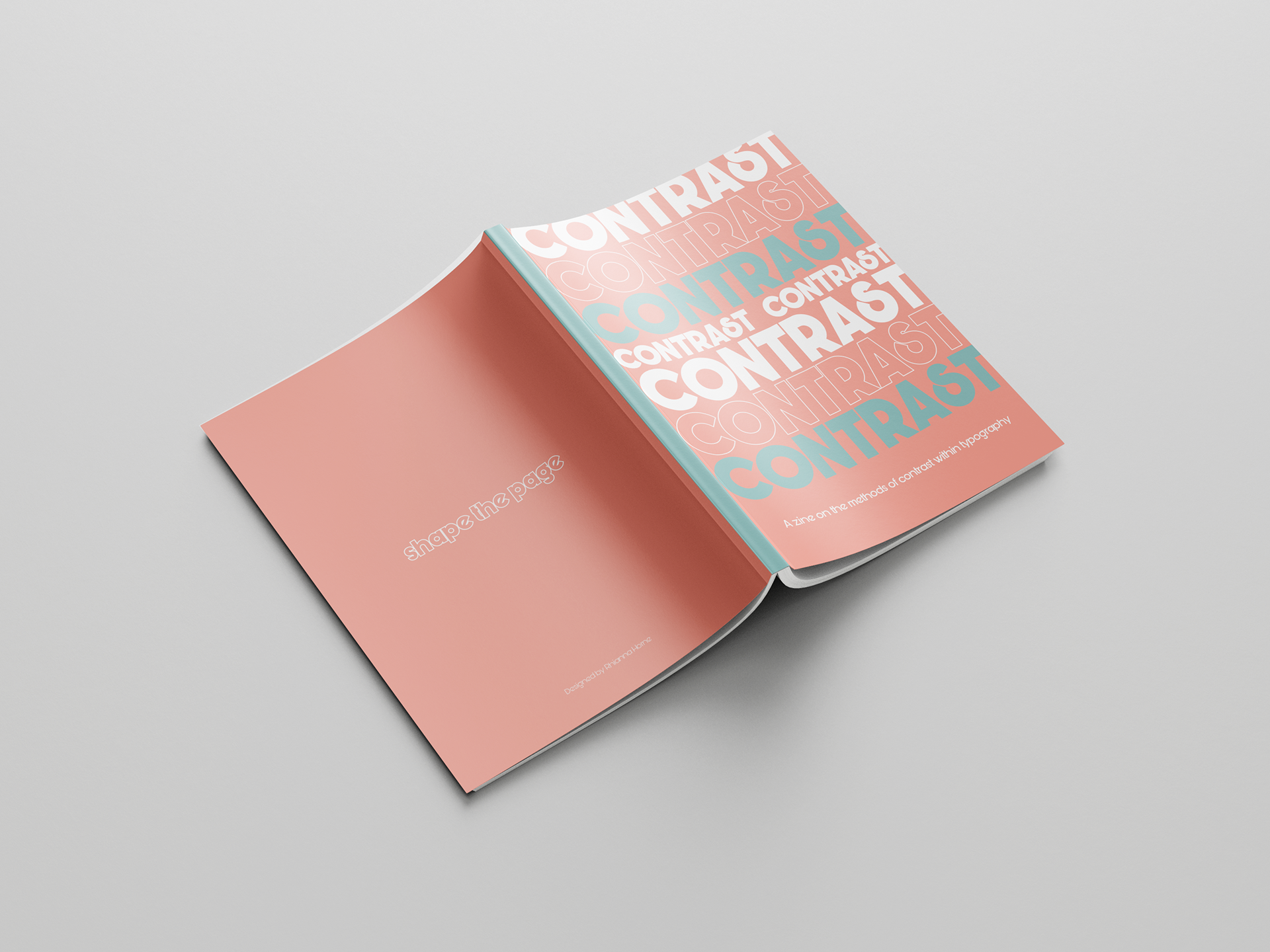
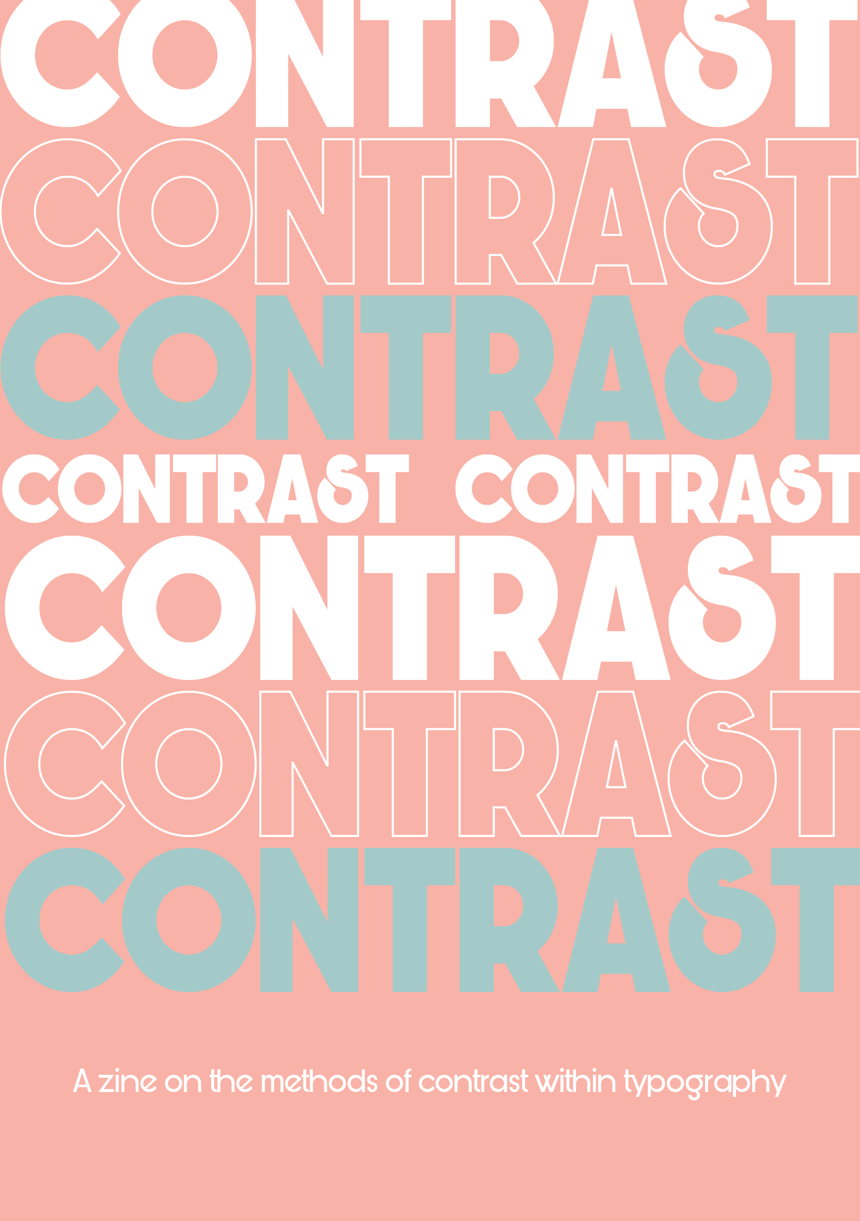
CONCEPT
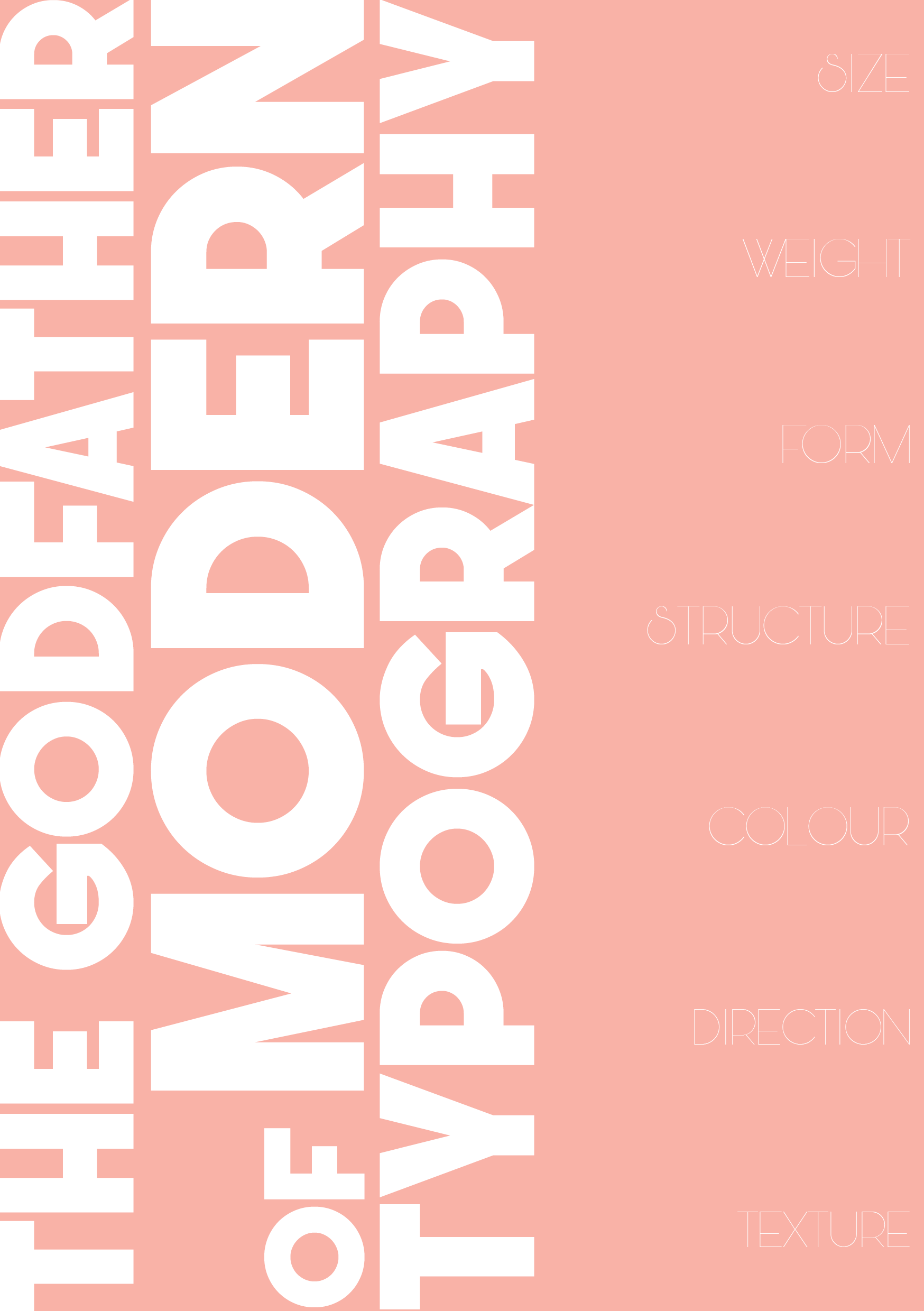
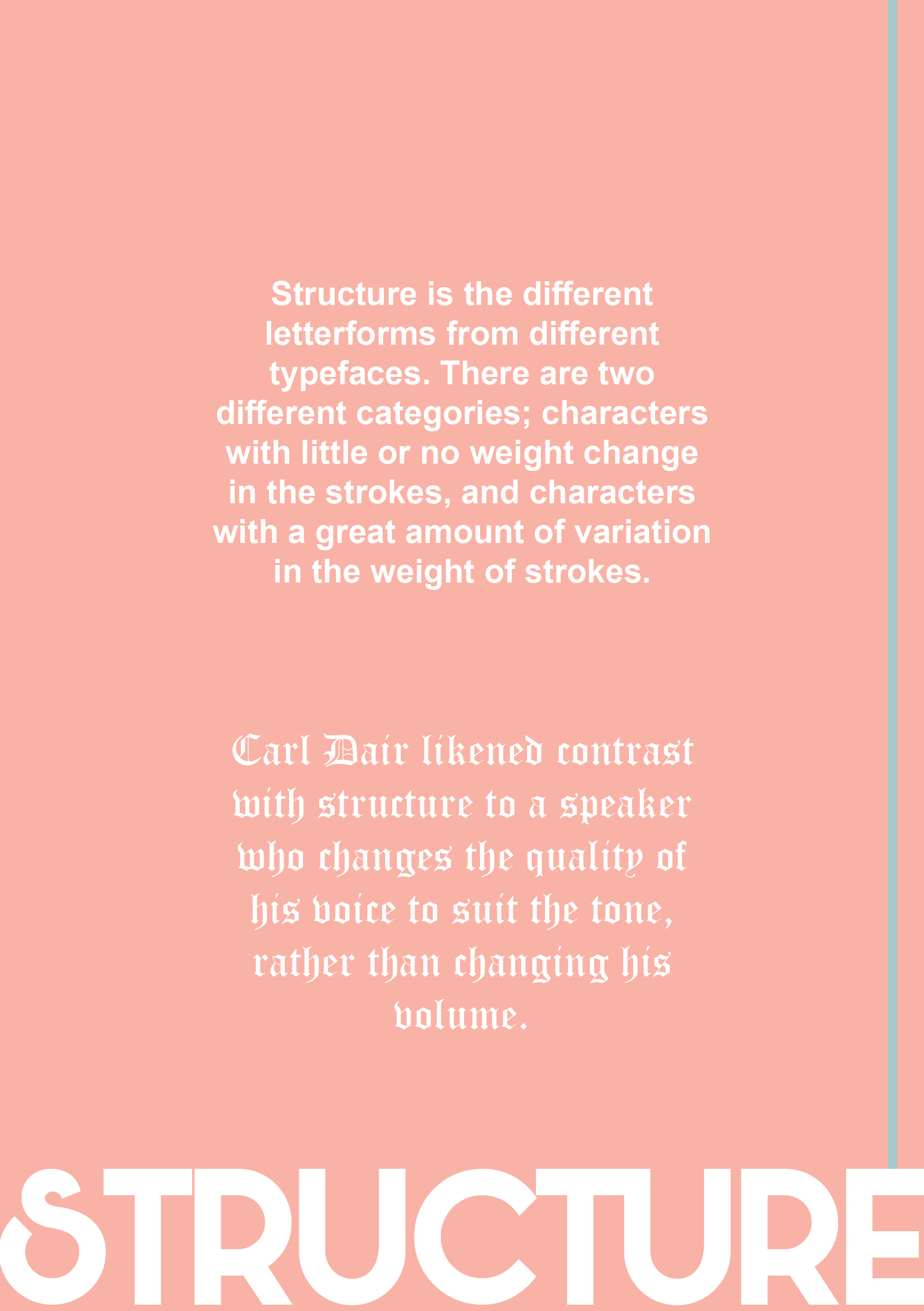
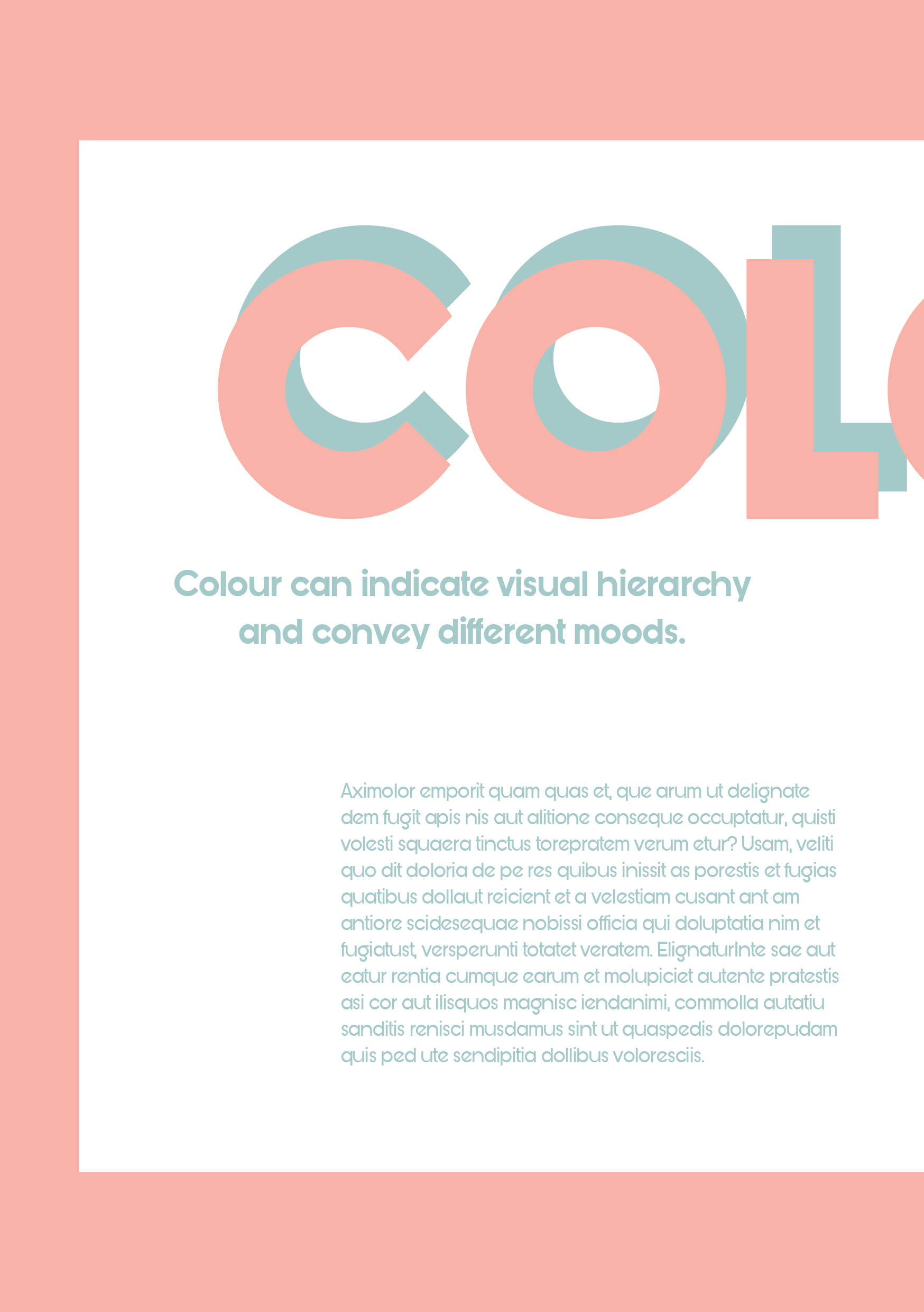
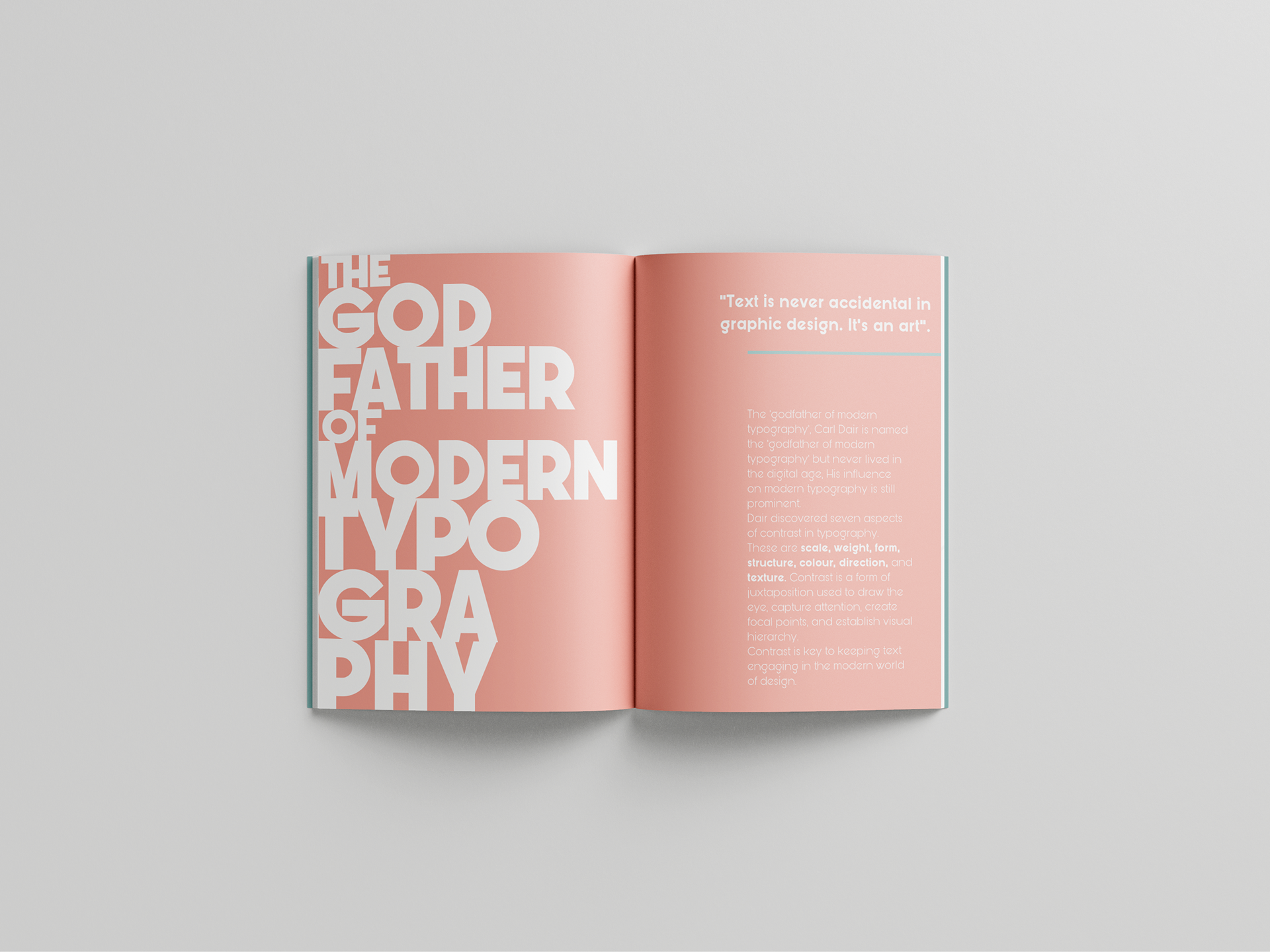
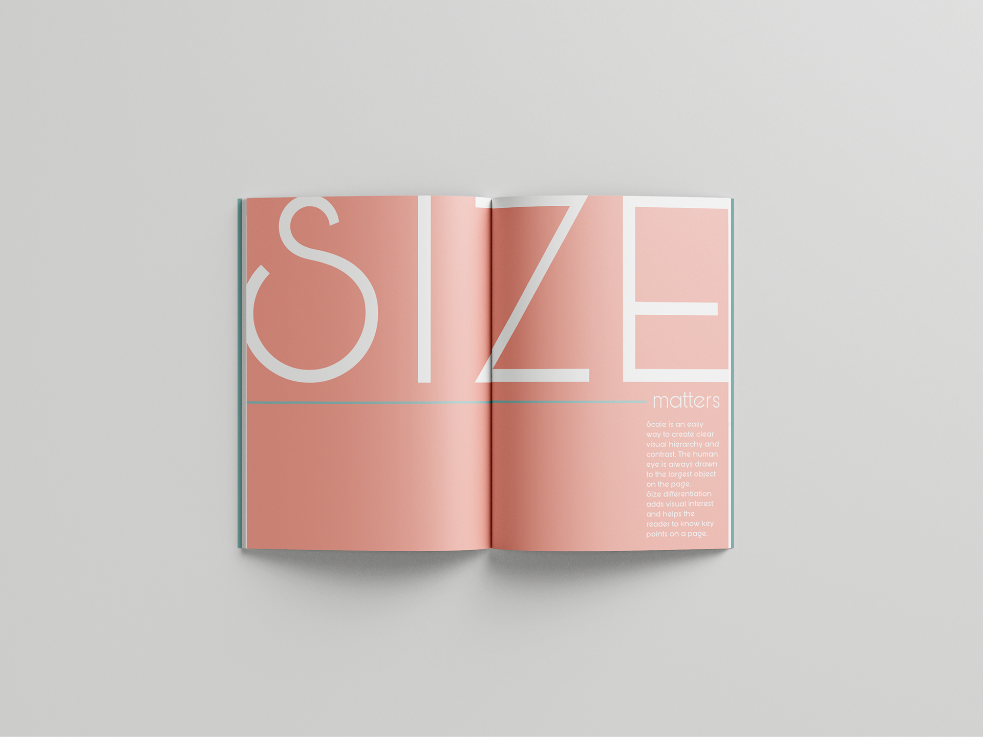
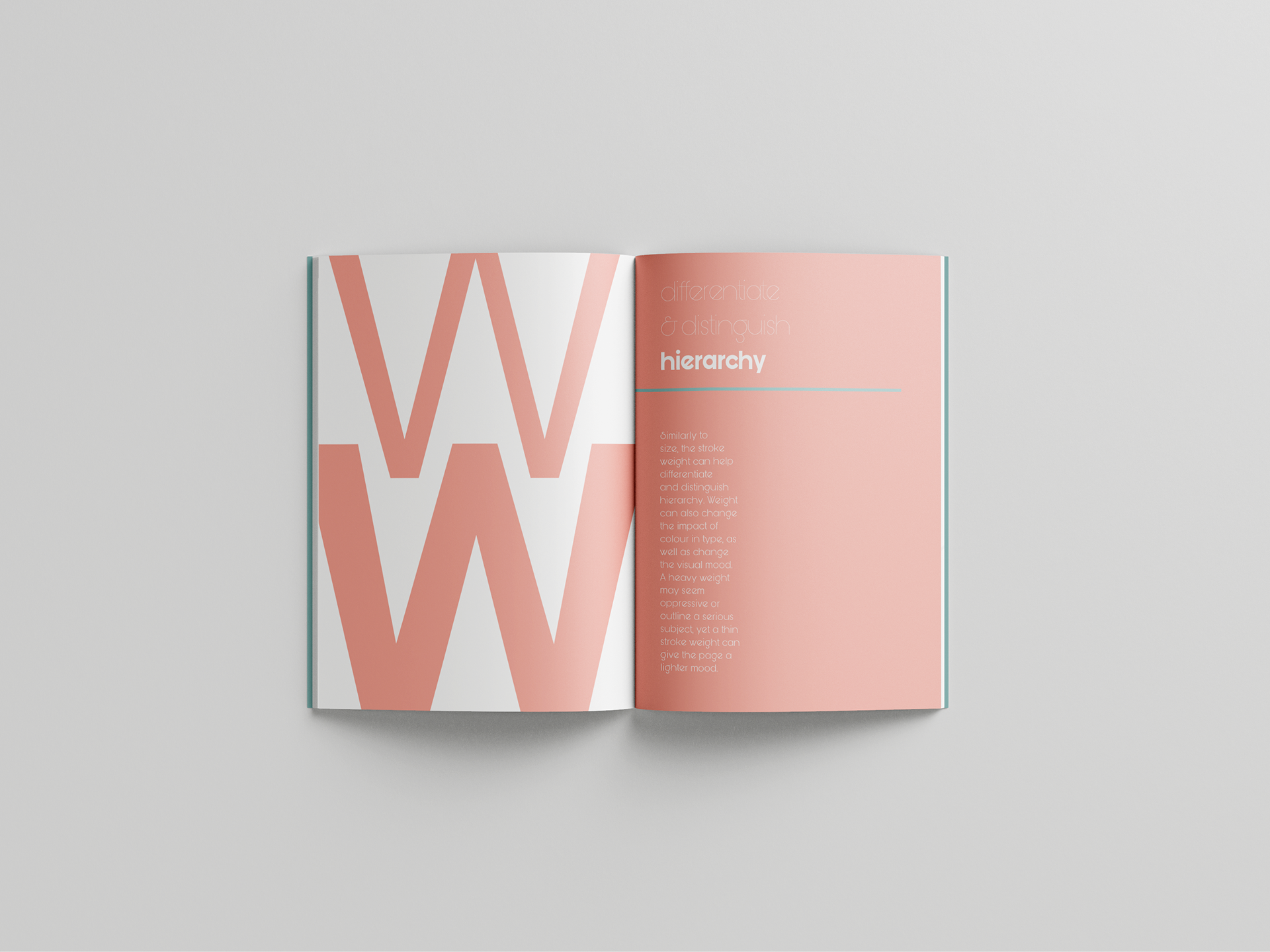
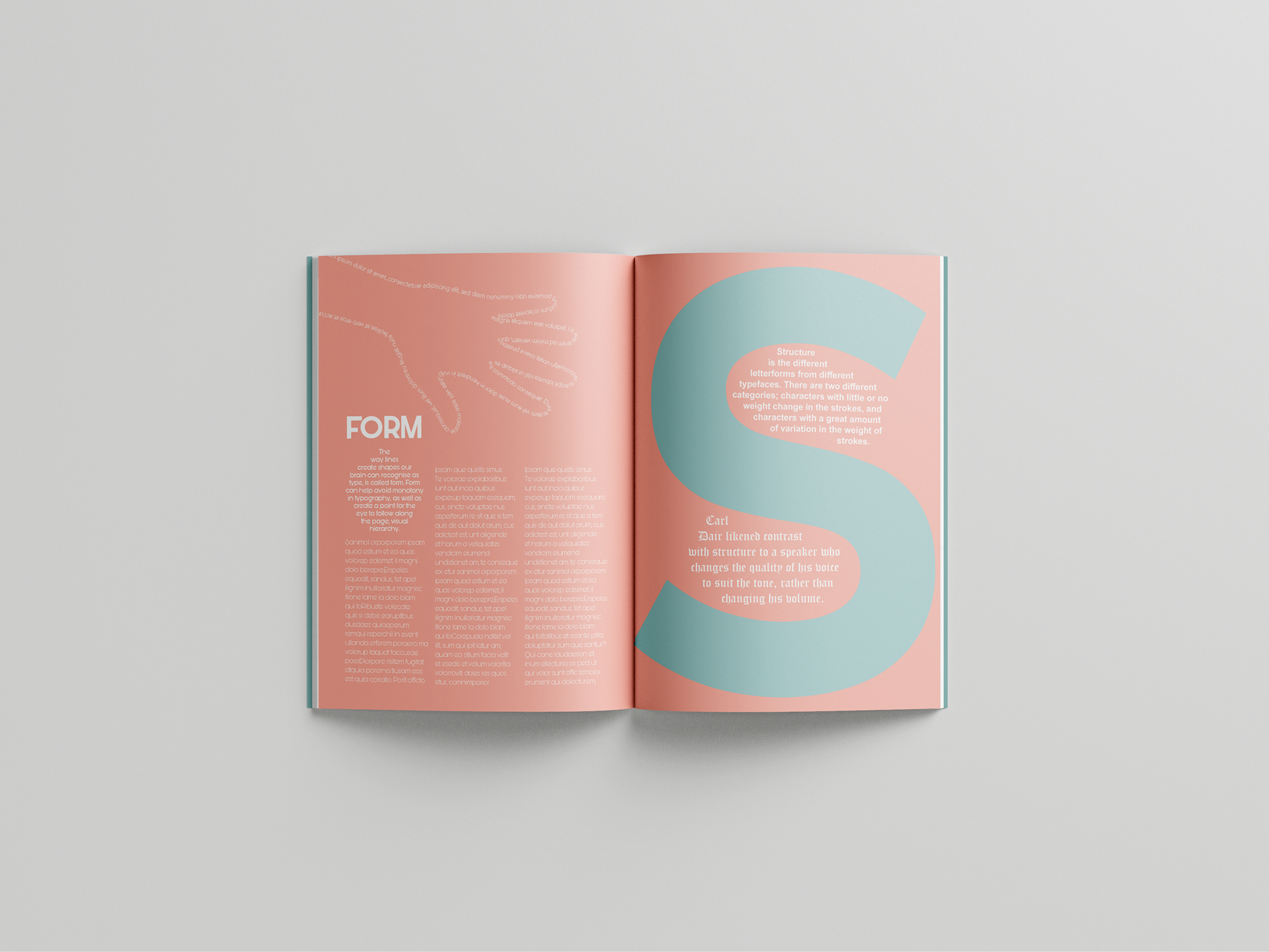
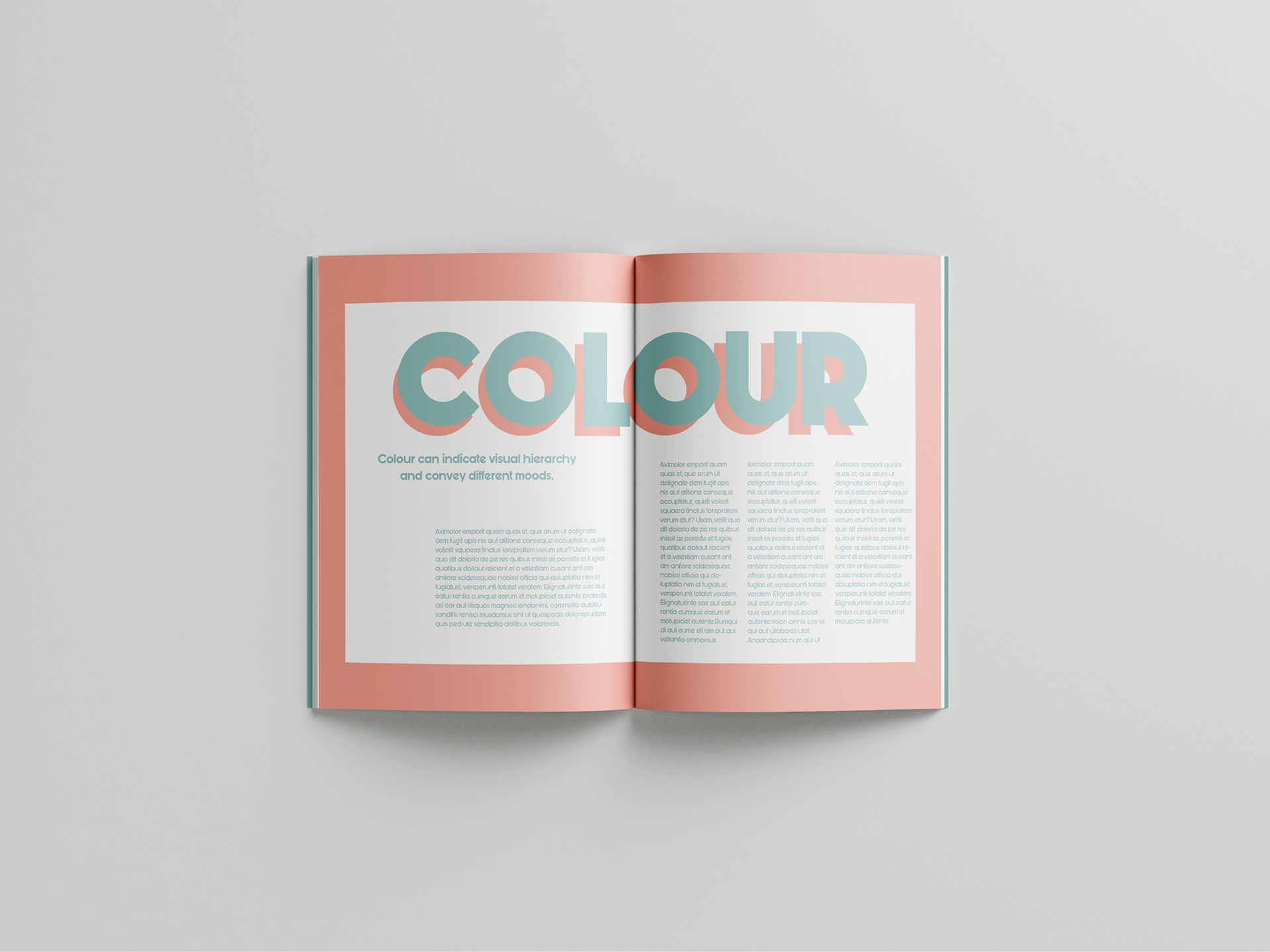
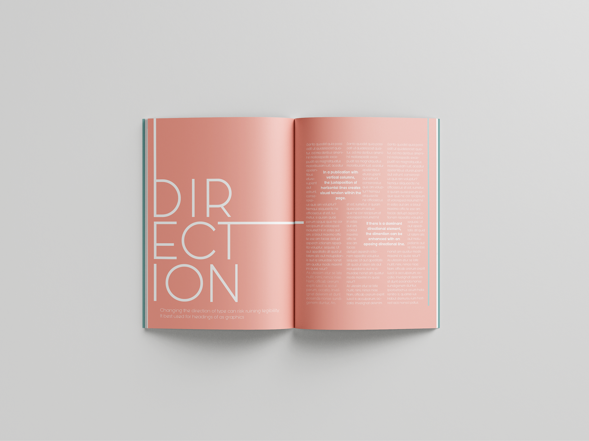
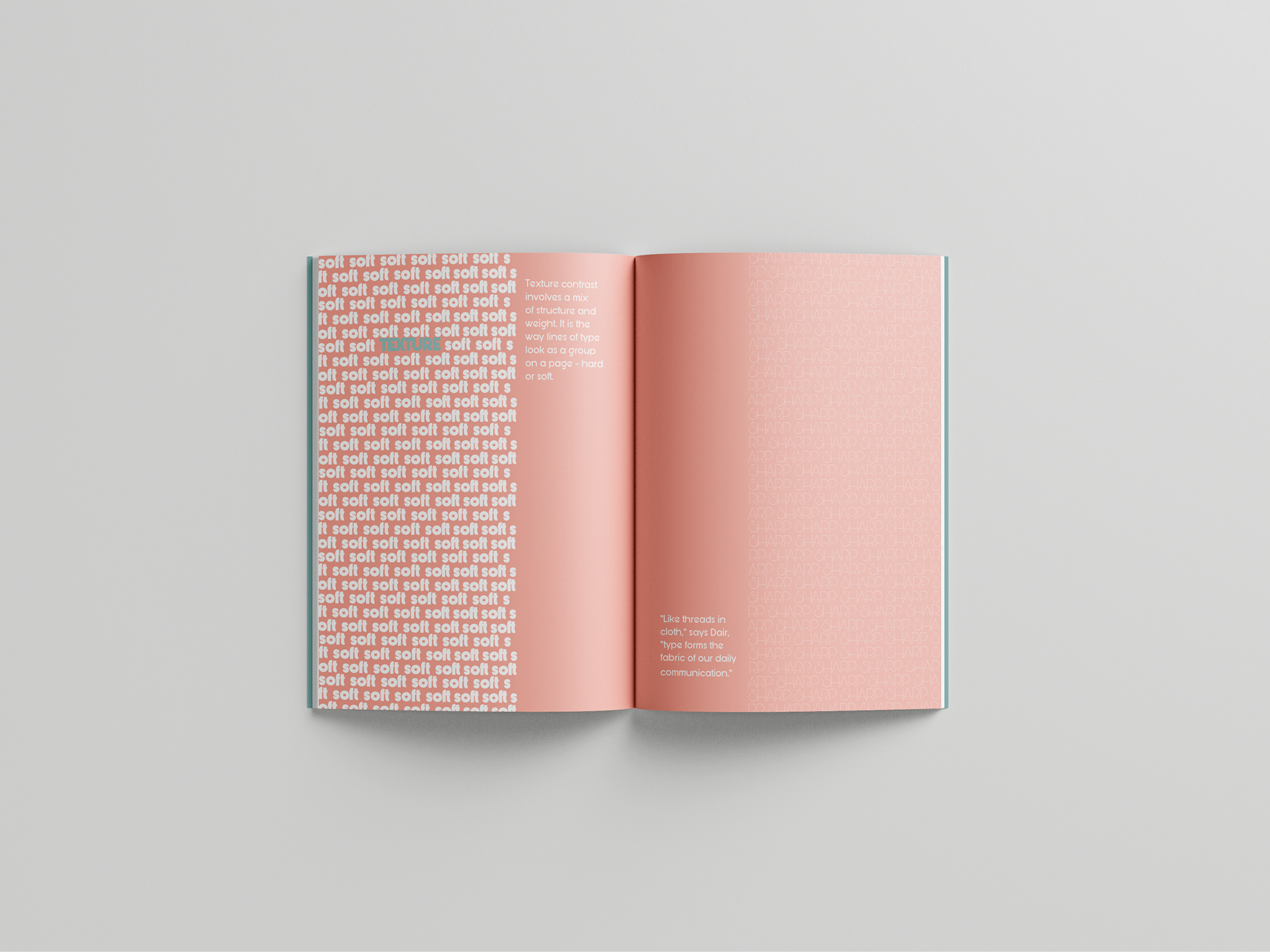
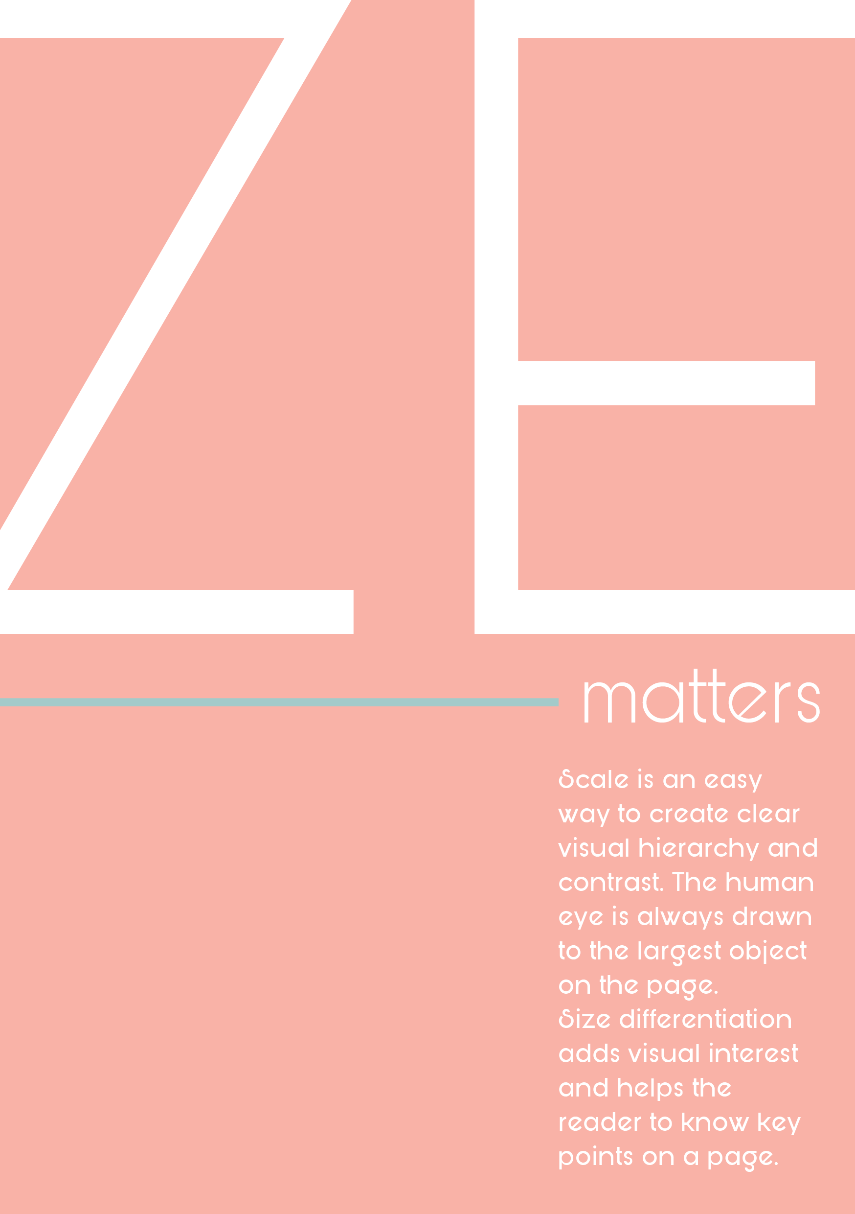
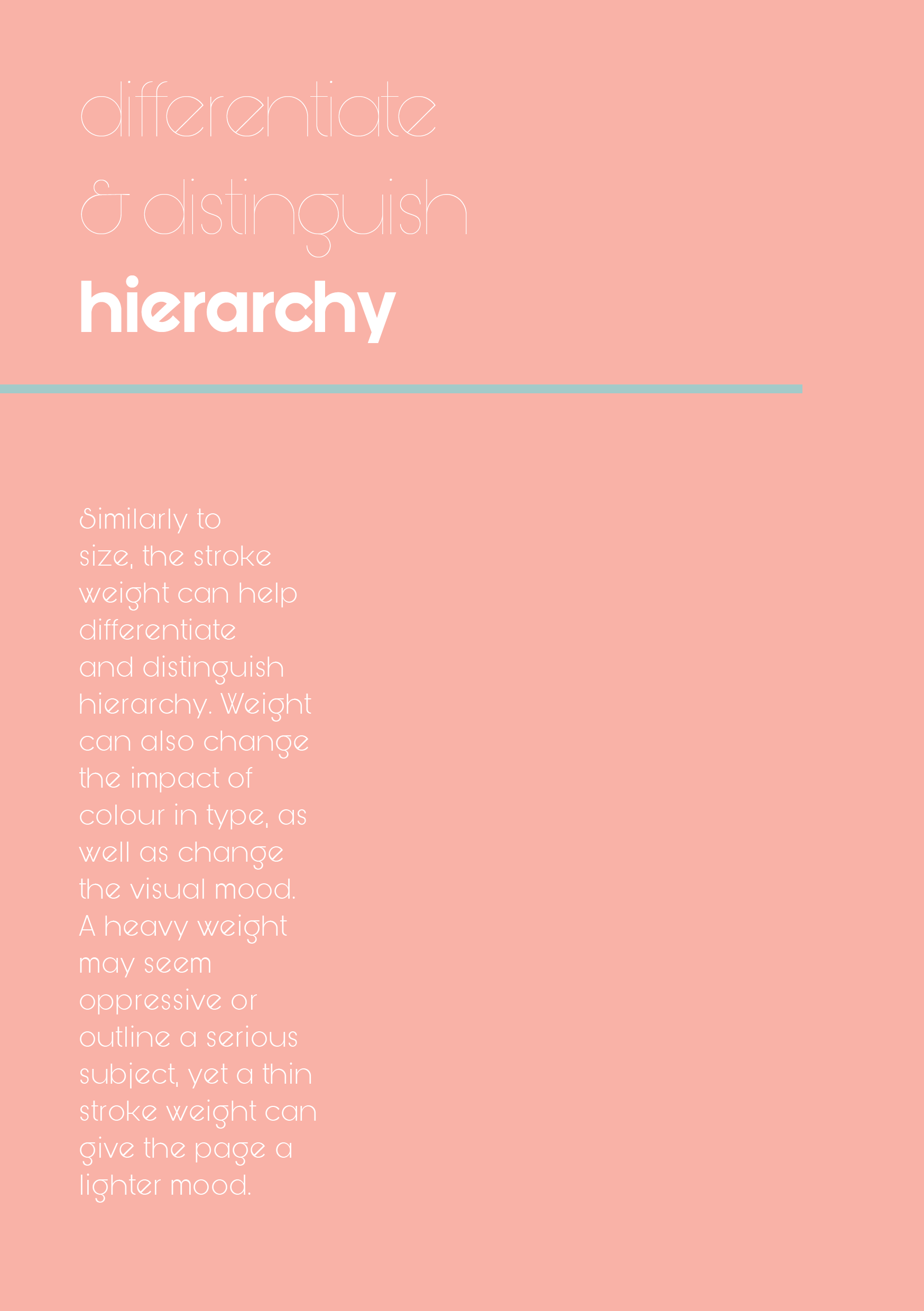
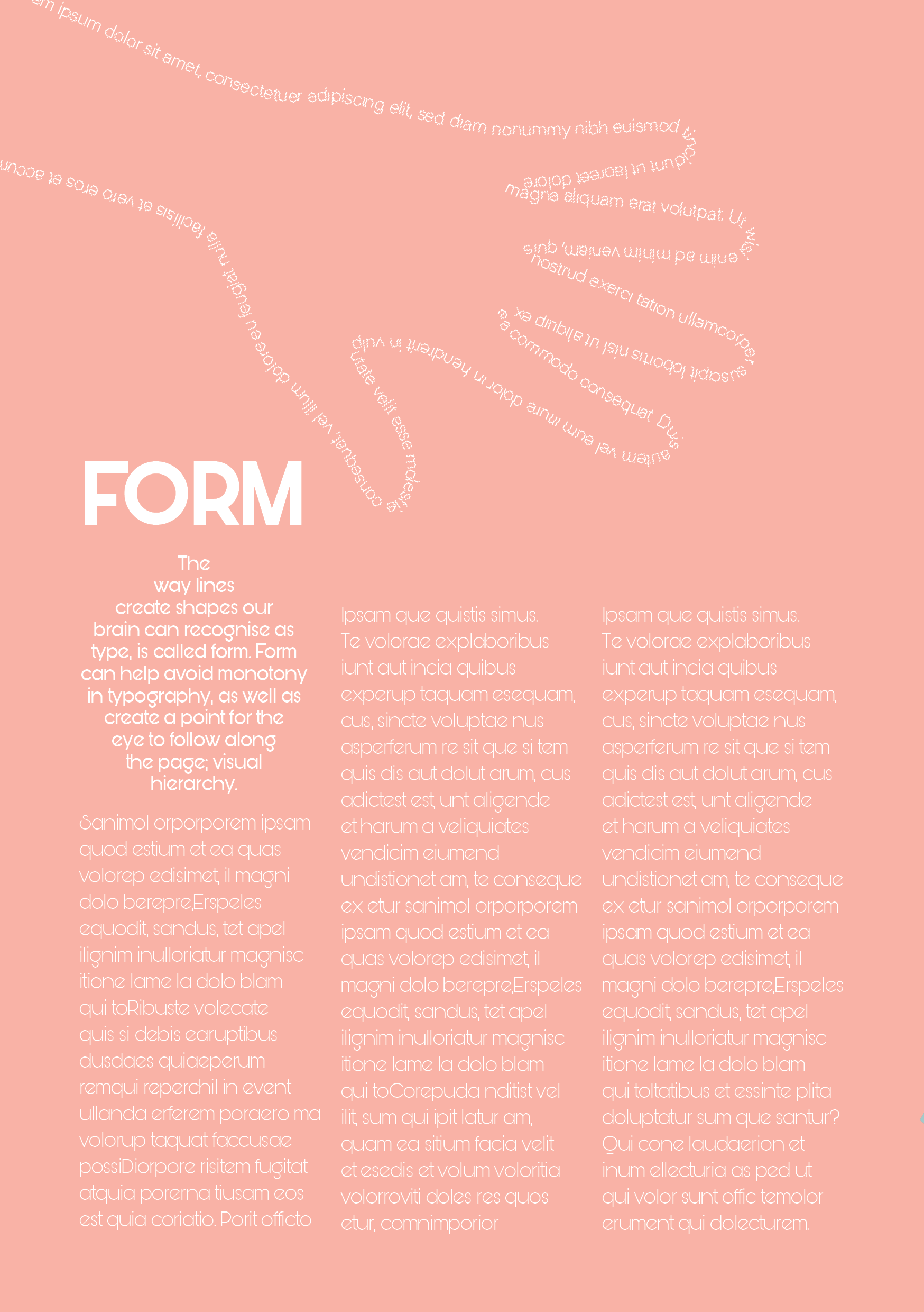
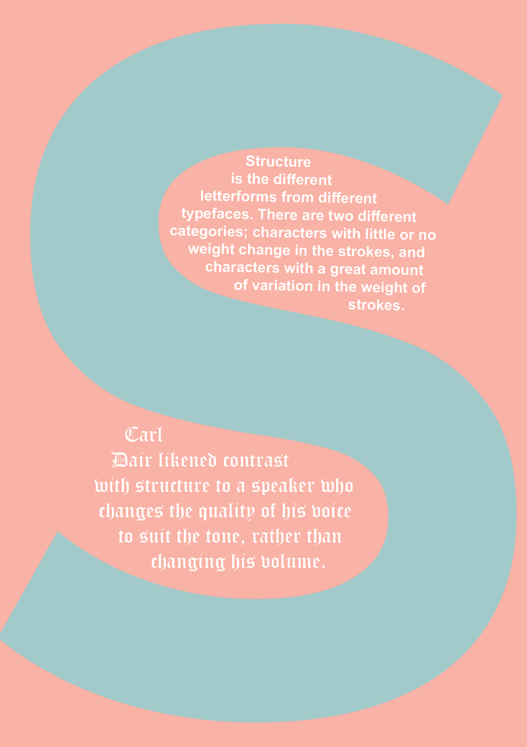
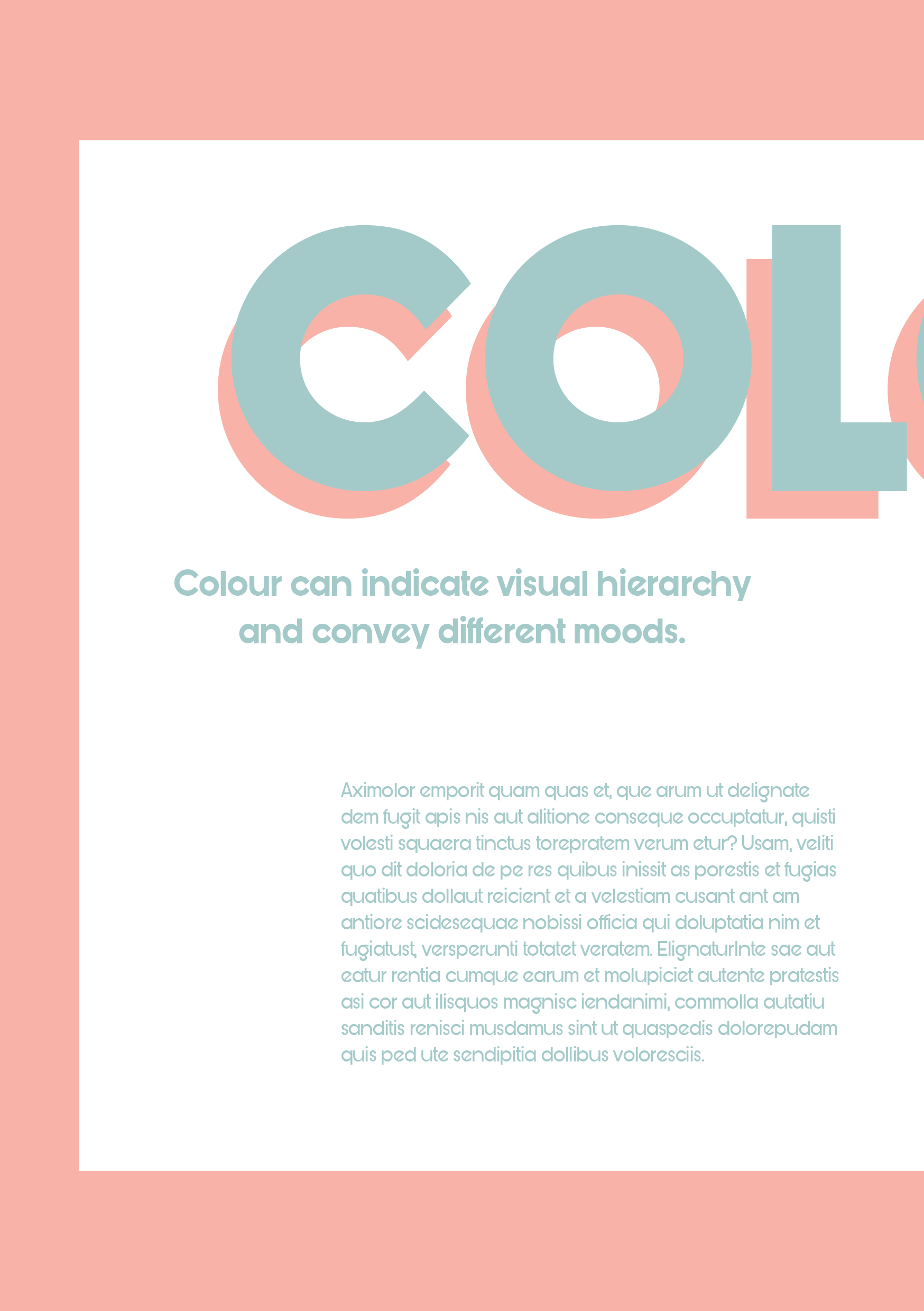
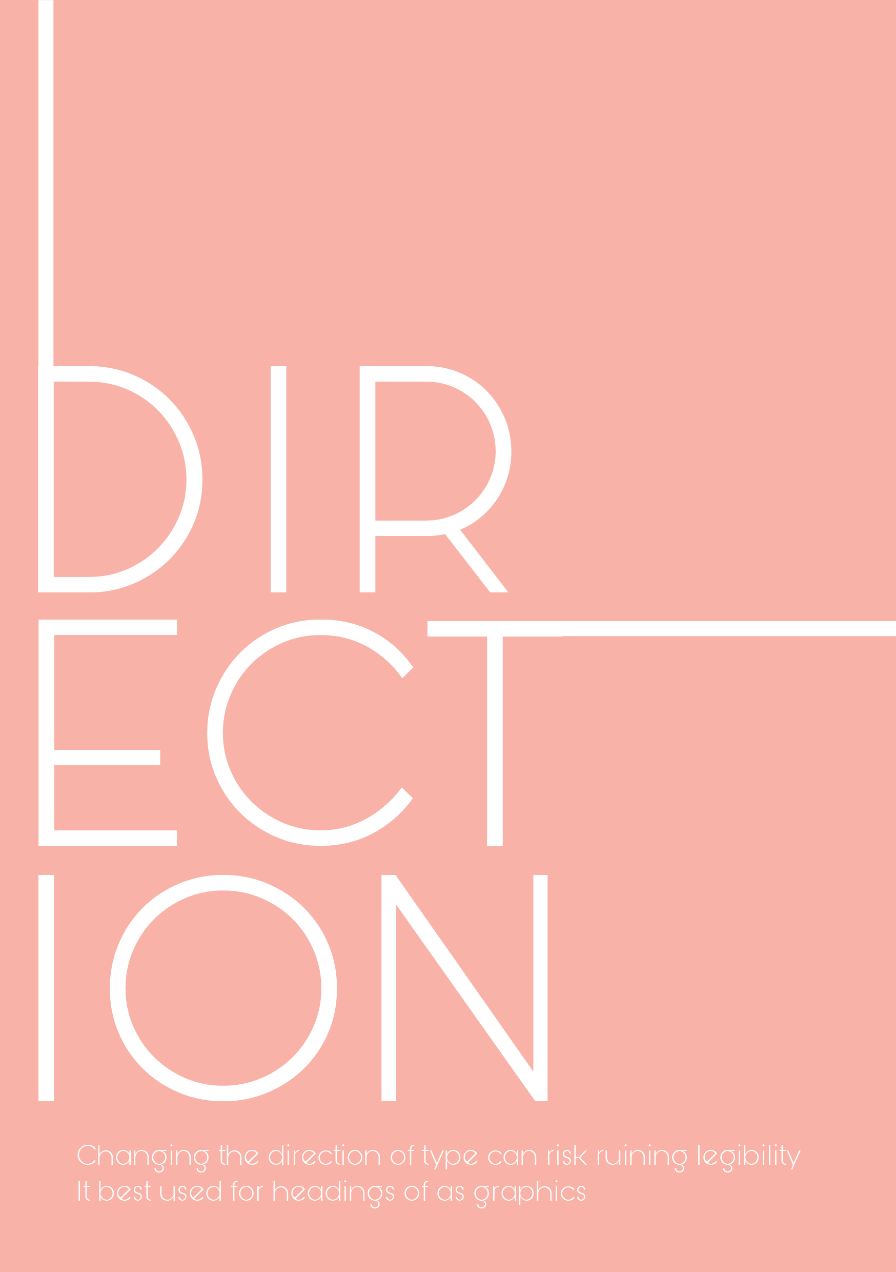
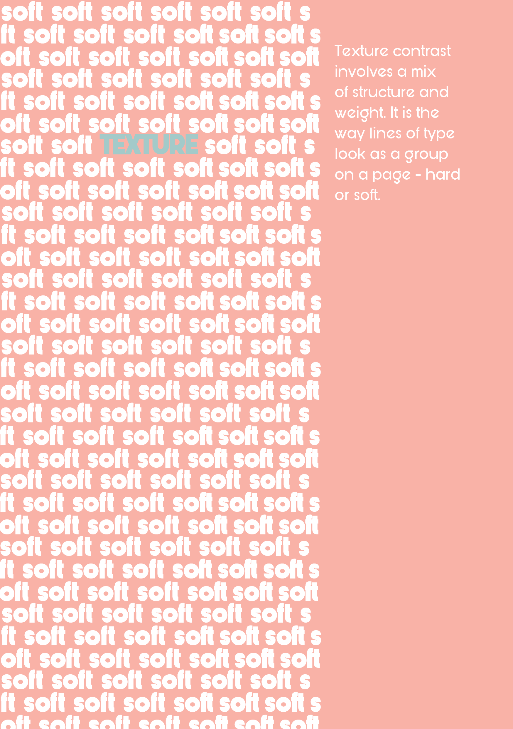
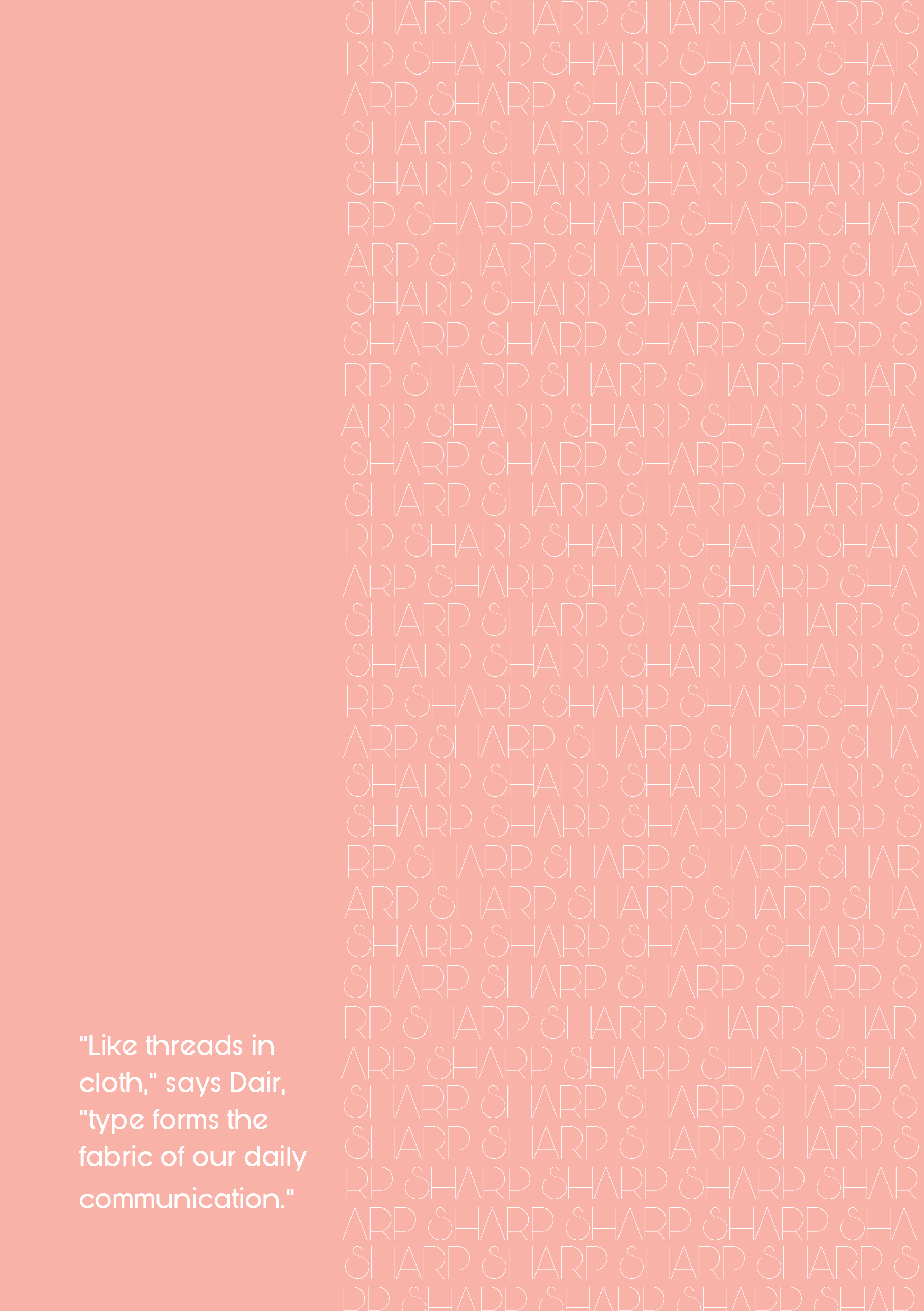
My concept for this zine assessment will be about contrast. Basing strongly on Dair's Seven Principles of Typographic Contrast (Dair, 1967), I will investigate and display several key principles which I personally enjoy using. This will include, but not limited to; size (scale), weight, structure, form, texture, colour, and direction.
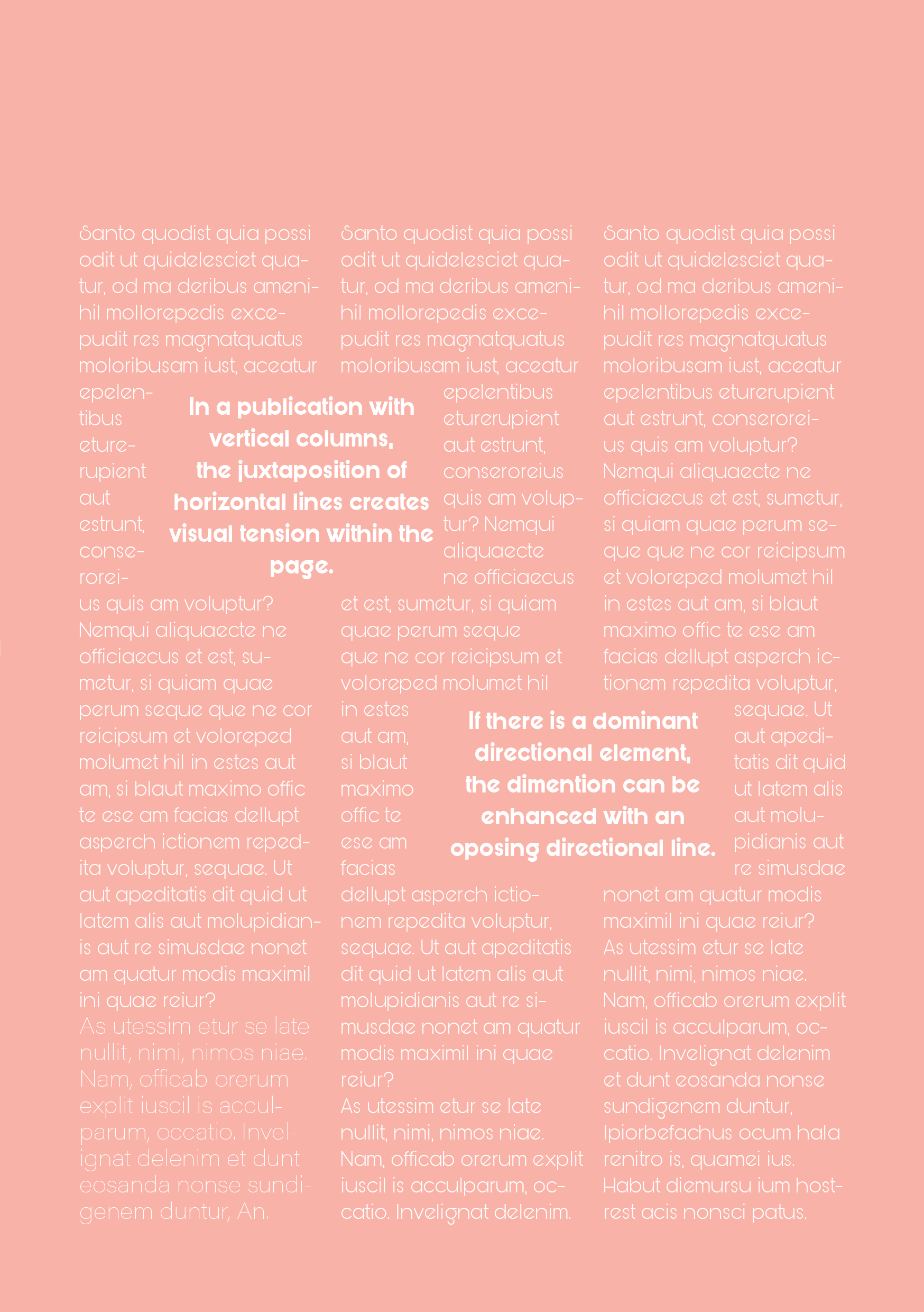
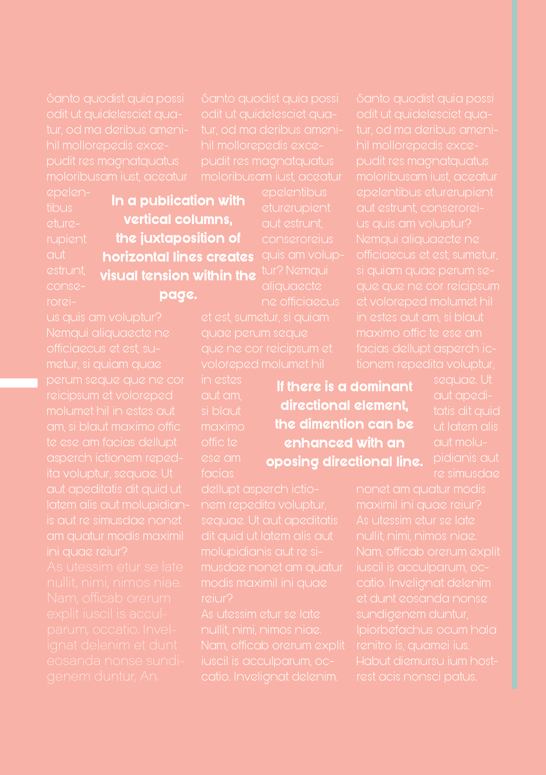
I have always loved juxtaposition and the subtle discomfort that comes with it. In this zine, I will investigate ways to create a juxtaposition that captures attention, creates focal points, and establish visual hierarchy.
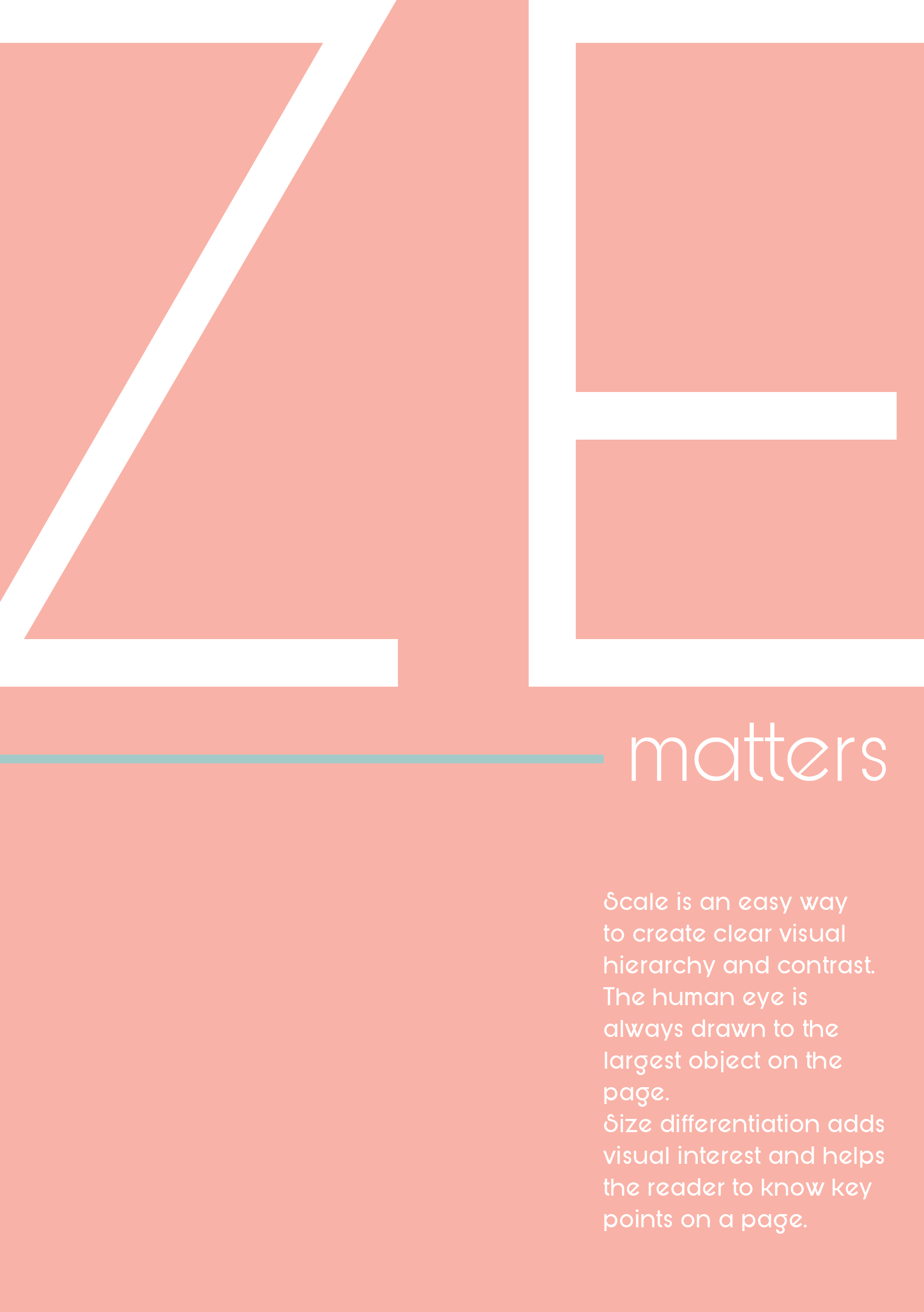
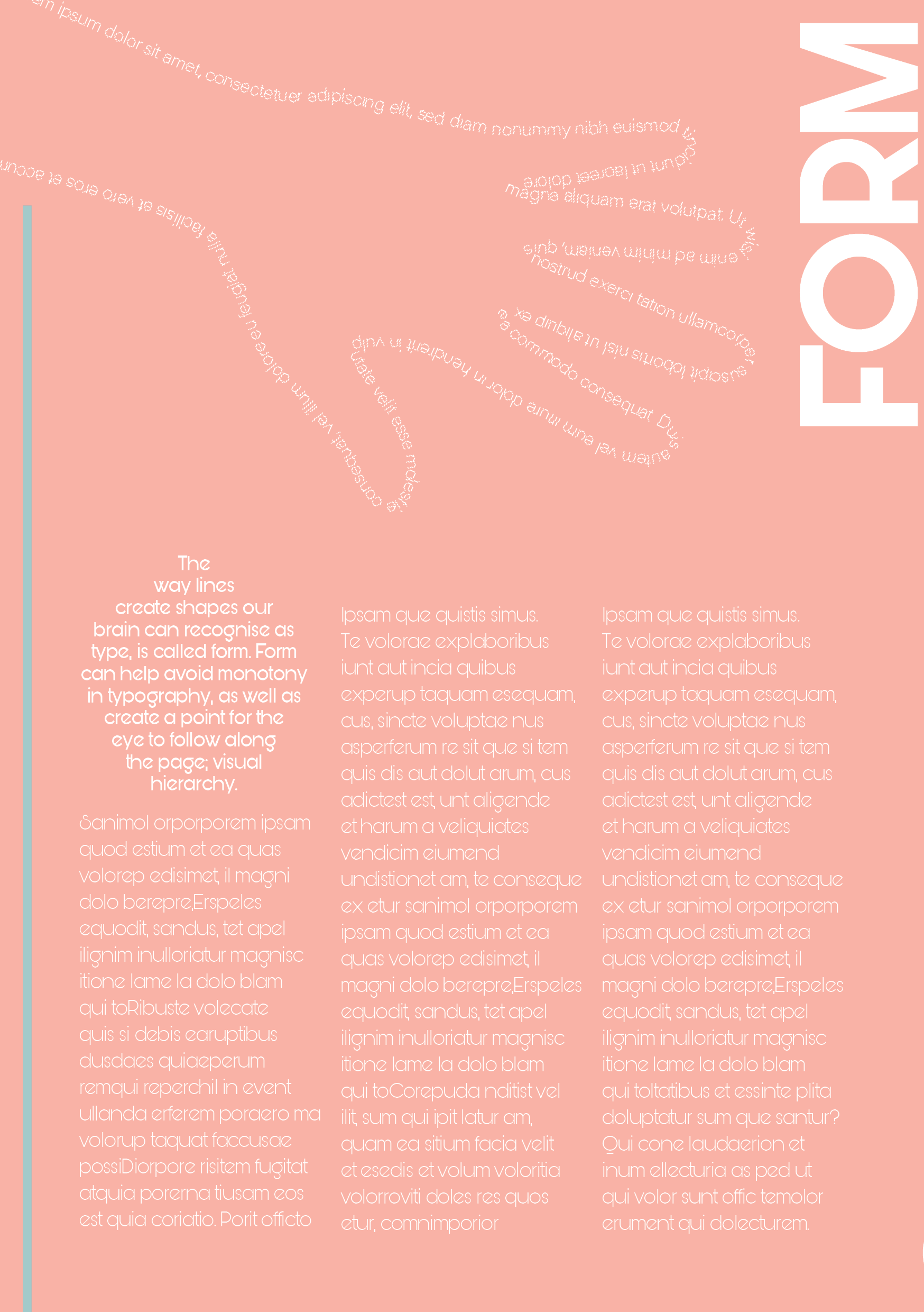
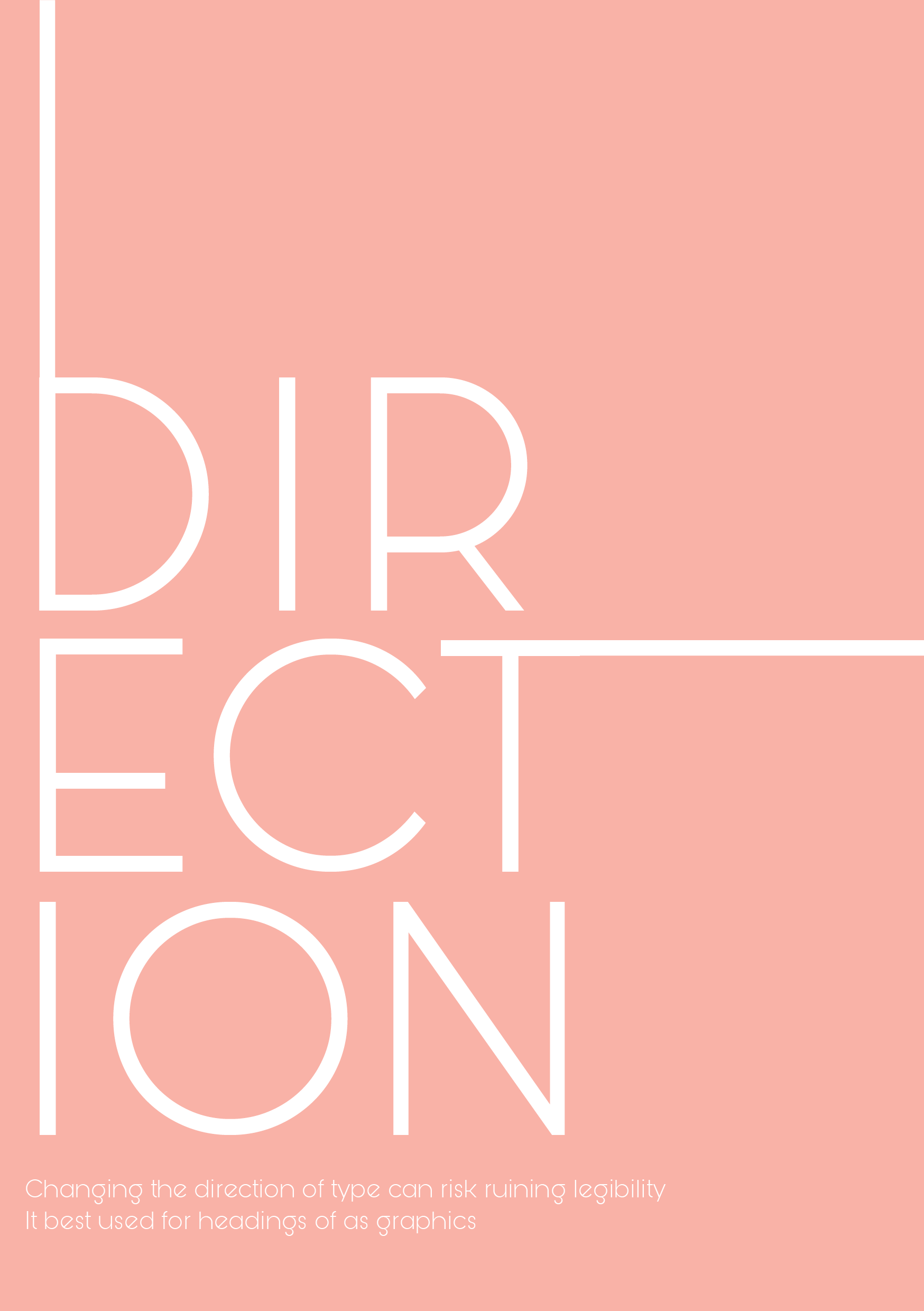
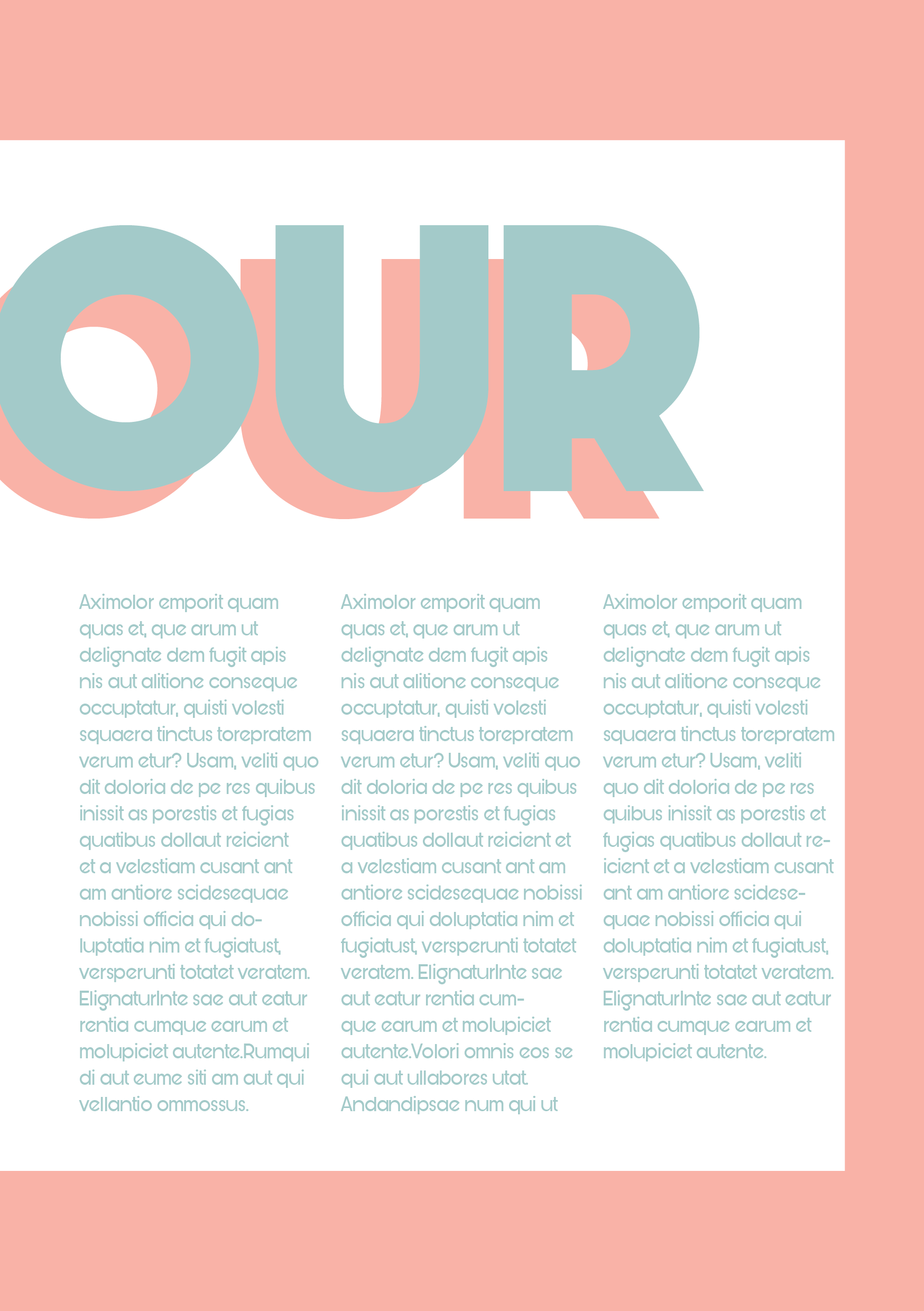
A personal favourite way to create contrast and interest is through the use of negative space. I love the way characters can be transformed into different shapes with slight positioning.
I want to try use only one typeface for the entire document to not ‘distract’ from the concept of the zine. I have chosen the typeface Bunya which has many variations for different uses which can be seen in my zine.
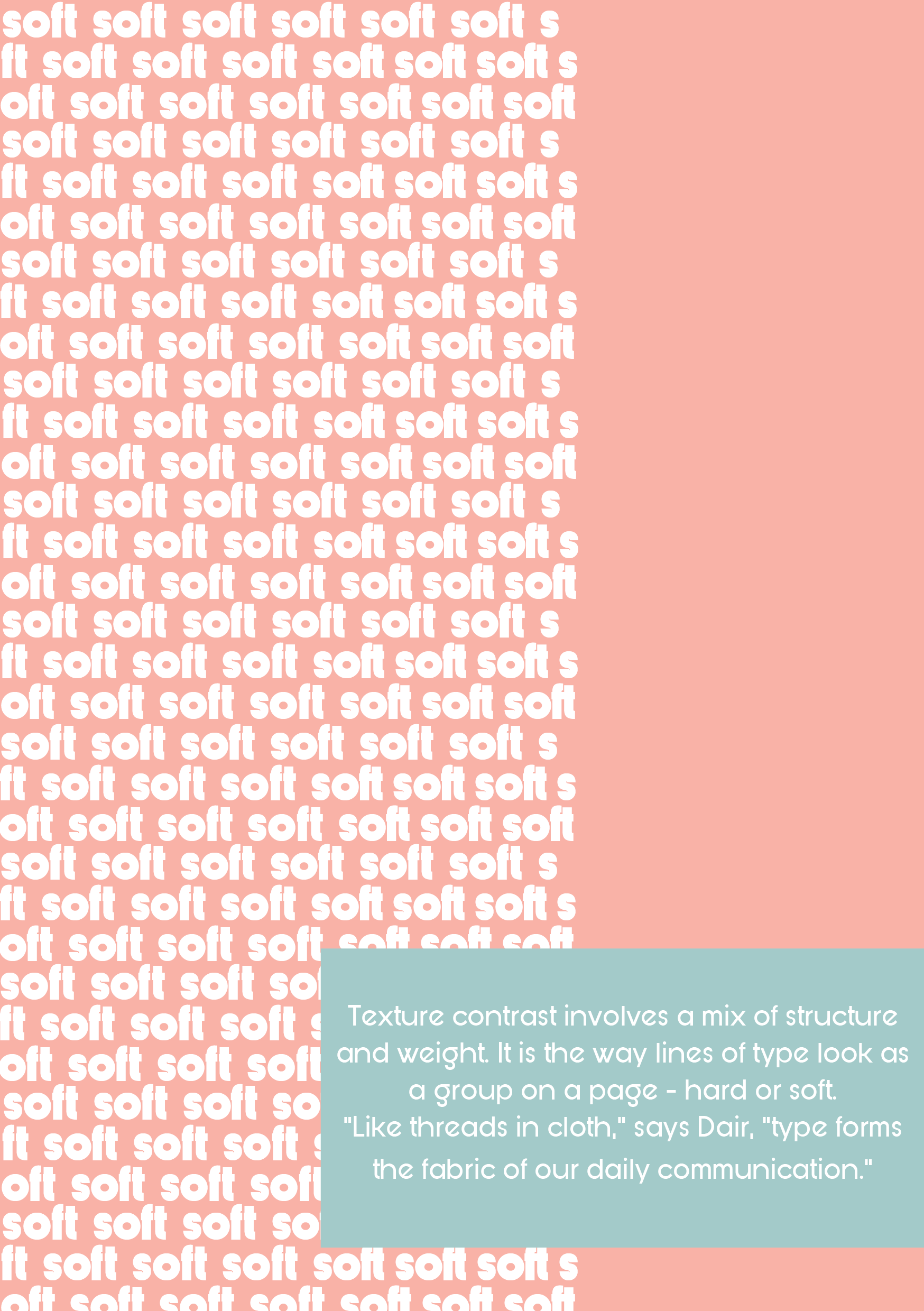
My goal in this zine is to create engaging pages that clearly shows visual hierarchy within text for each principle in typographic contrast.
DRAFT


FINAL


RESEARCH REFERENCES
Dair, C. (1967). Design with Type. University of Toronto Press. http://www.jstor.org/stable/10.3138/j.ctt2ttgbr
Berry, D.J. (2003, July 28). dot-font: Seven Principles of Typographic Contrast. Creative Pro. https://creativepro.com/dot-font-seven-principles-of-typographic-contrast/
READING REFERENCES
Samara, T. (2005). Thinking. (n.a.), Publication Design Workbook: A Real-World Guide to Designing Magazines, Newspapers, and Newsletters (1, pp.14-35). Quarto Publishing Group USA. https://ebookcentral.proquest.com/lib/qut/detail.action?docID=3399837
Bringhurst, R. (2012). Chapter 6: Choosing and Combining Type. Robert Bringhurst (4th Ed.), The Elements of Typographic Style (4, pp. 93-118). Hartley and Marks. https://content.talisaspire.com/qut/bundles/604029c347e64316730f0cb4